The Importance of Good Lighting in Interiors Photography
When it comes to photographing property; it’s less about location, location, location and more about light, light, light. Ambient light, artificial light and (this is where we come in), flash light. Good lighting in interiors photography is crucial.
As we walk around the world, most things appear to be pretty well lit. The human eye and brain have a pretty amazing ability to record detail in the brightest and the darkest places at the same time. Cameras unfortunately are far more limited. Even the presence of artificial lamp light leaves horrible colour casts over a scene when rendered on camera. Something the human eye would adjust for and correct without us even noticing. There are a few ways to combat this shortcoming and one of the best is to brighten a scene with additional lights.
I’ve put together nine examples of everyday rooms and scenarios where we’ve had to add some additional light to overcome the shortcomings of current camera technology.
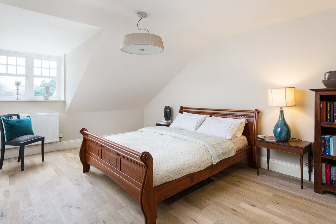
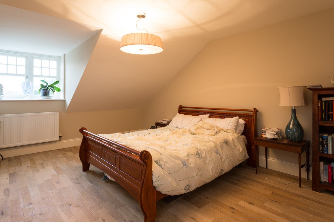
The simple loft bedroom was being over powered by the ceiling light. The bed was also (badly) made up with two single duvets and the whole room needed a bit of styling to make it look its best. Turning off the centre light, carefully re-arranging the two single duvets to looks like a double and the addition and removal of various items around the room meant that, with some added flash light the room was transformed from unloved and gloomy to bright and inviting.
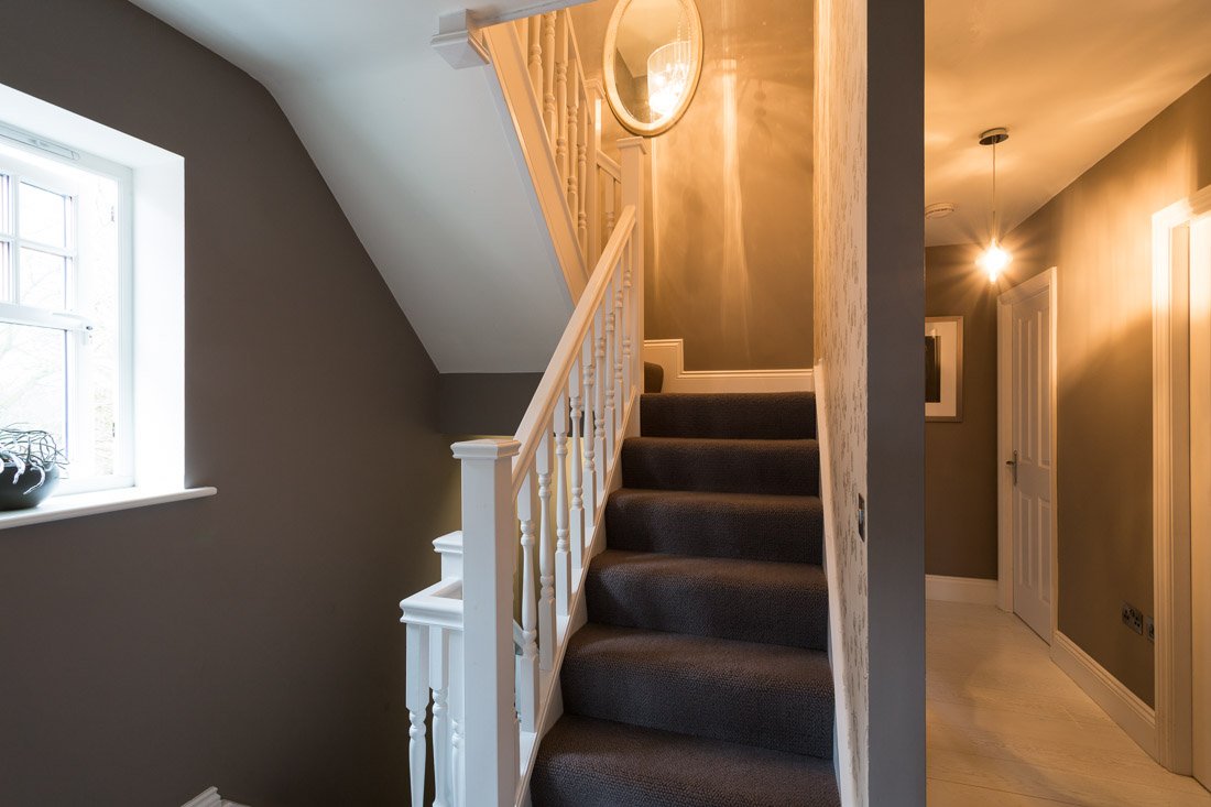
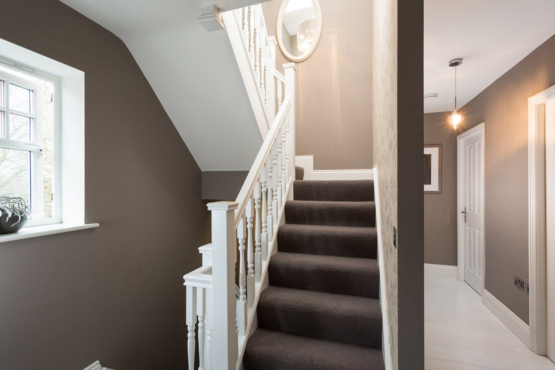
This hallway looked really nice before you tried to photograph it. In camera the light gave off an overpowering orange glow and the area looked gloomy. Some carefully added lights allowed me to shorten the exposure, revealing some more detail in the window frame and view of trees behind. I was also able to emphasise the bannister details more clearly, and extra light also made the distant spaces down the corridor and up the stairs look much more alluring.
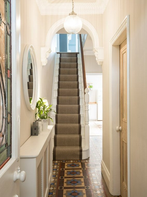
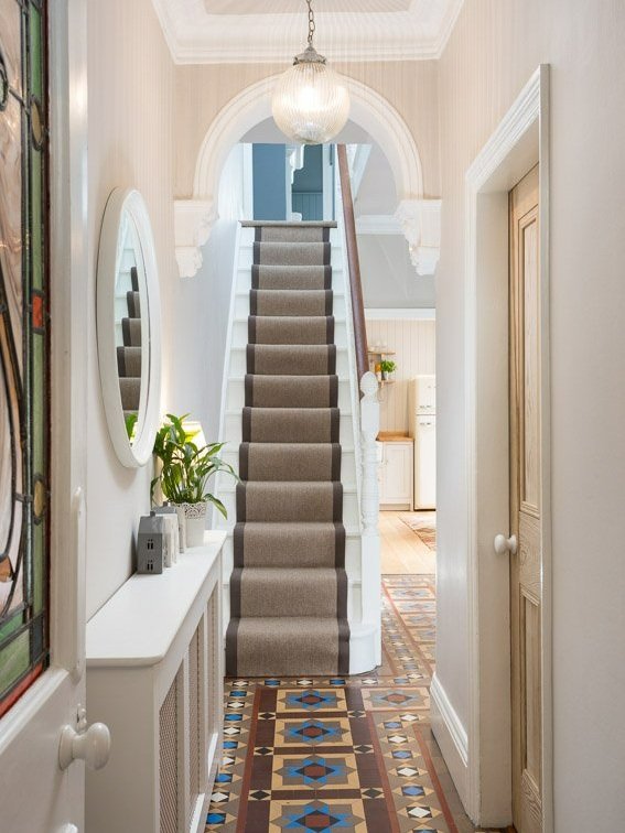
The entrance hallway to this Edwardian property was particularly stunning thanks to the wealth of period features and laid back style. As is typical with this type of hallway, there was little to no natural light and the contrast between the brightly lit kitchen and the hallway was well outside what the camera was able to capture. Turning on the ceiling light helped to balance the light better but did not give a particularly flattering light or colour rendering to the hallway. To make the final photograph I shortened the exposure to bring down the brightness of the kitchen, upstairs room and the intensity of the ceiling light and added a number of flashes. One at the top of the stairs, another to the right of the bottom of the stairs and a blend of shots with a flash in a white umbrella on the floor to light the ceiling of the closest space and that was masked out with another shot where a flash was bounced off the ceiling of the closest space to light the spectacular floor.
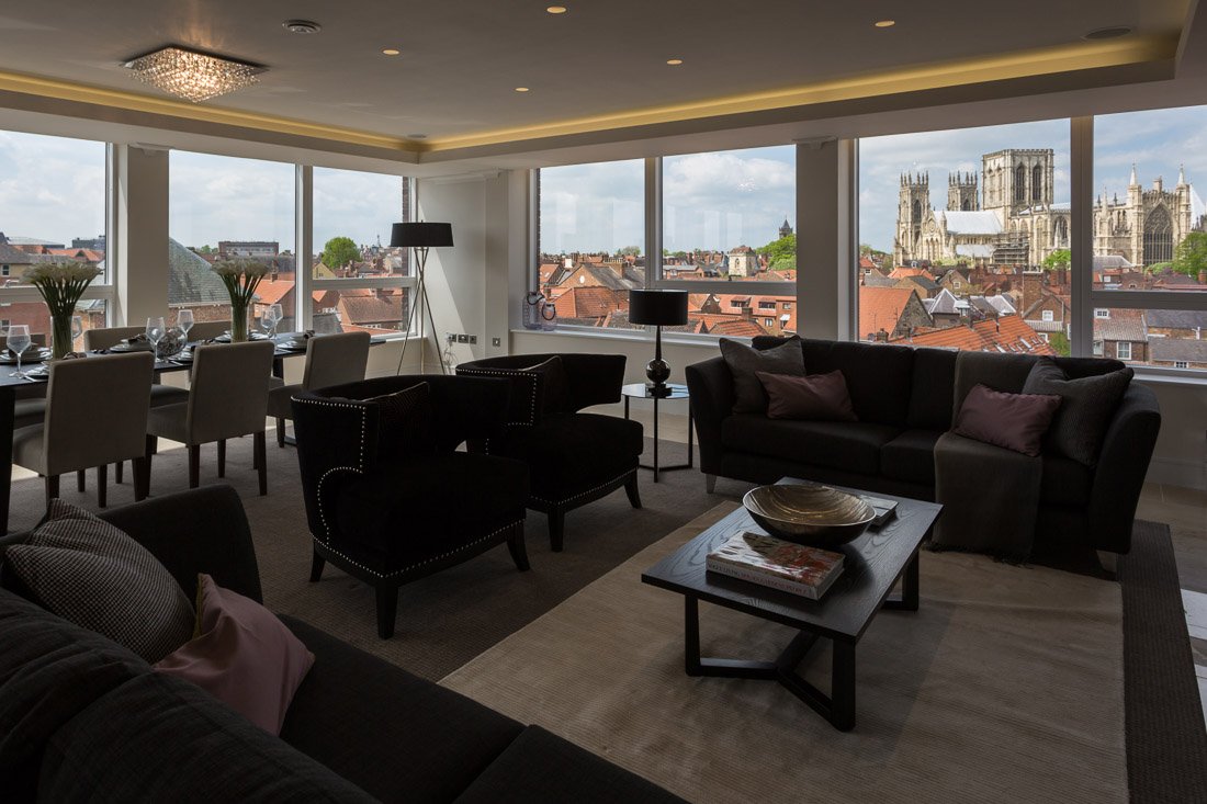
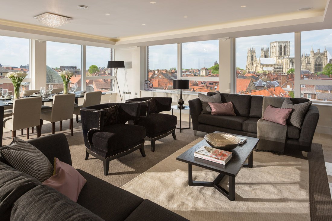
This is a new build penthouse flat in central York with a mighty impressive view of York Minster. Here it was necessary to add additional lighting to balance the brightness between the view and the interior. A couple of flashes were fired directly into the room to replicate low winter sun.
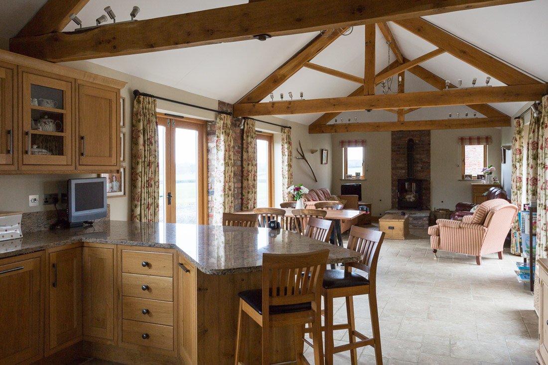
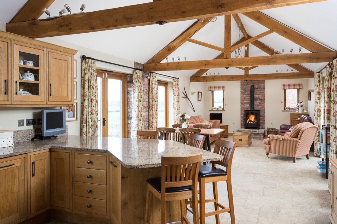
Long rooms are notoriously difficult to photograph and light. Careful composition is required to prevent the room from appearing thin and narrow and lighting them can be particularly difficult as there is often nowhere to position lights. In this converted barn I first lit the top half of the frame by bouncing flashes off the floor. I then moved the flashes to sit on the ceiling trusses and bounced light off the ceiling onto the floor. There was an additional flash in both setups to light the kitchen bounced off the (out of shot) wall to the right of the breakfast bar. The two shots were then combined in Photoshop to give this final image.
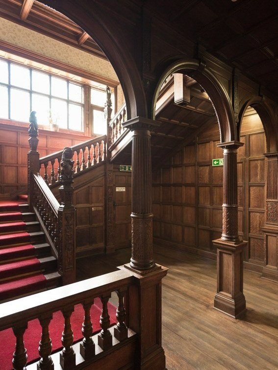
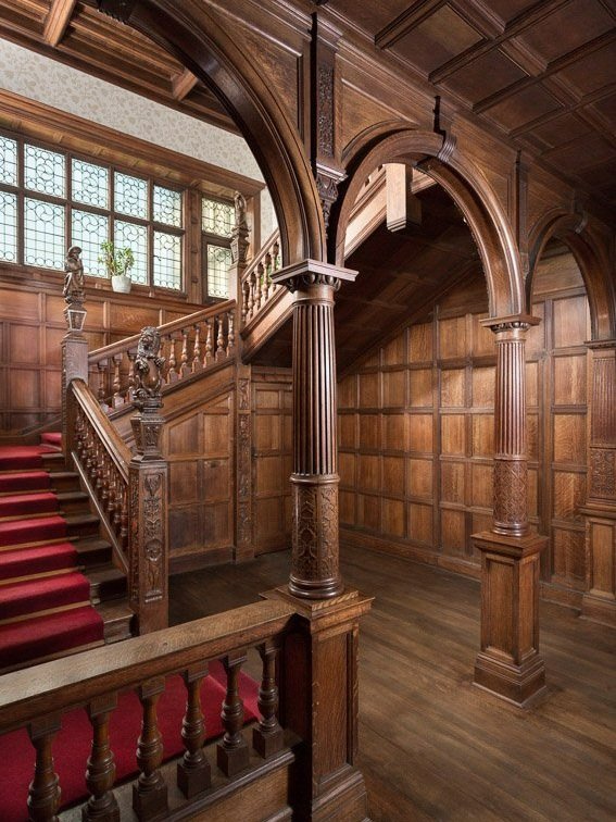
Now the entrance hallway to a first floor flat, this spectacularly dramatic, panelled hallway required an enormous amount of added light. To get an sort of detail in the oak panelling the beautiful leaded window had to be seriously overexposed which meant there was not only no detail in the windows but the rest of the shot was subject to haze resulting in an extremely unsatisfactory photograph. By strategically adding 5 additional lights I was able to reduce the ambient exposure resulting in a much more attractive window at the same time as using the flashes to pick out on the intricate woodwork details and create a much more attractive image.
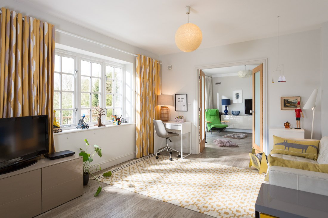
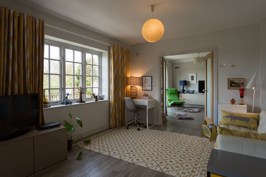
This family room and adjoining lounge was at the rear of a detached house in York. As I wanted to capture the main front shot of the house with the sun on it, the timing meant these rooms at the back of the house where not receiving the beautiful sunlight that they would later on in the day. I was able to position a powerful flash outside on the terrace which, along with a number of additional lights, transformed the rooms from slightly gloomy to lovely and bright. To compound my decision to time my visit with sun on the front of the house, the afternoon saw the arrival of dark skies so even if I had waited around for another four hours I still wouldn’t have got light like this!
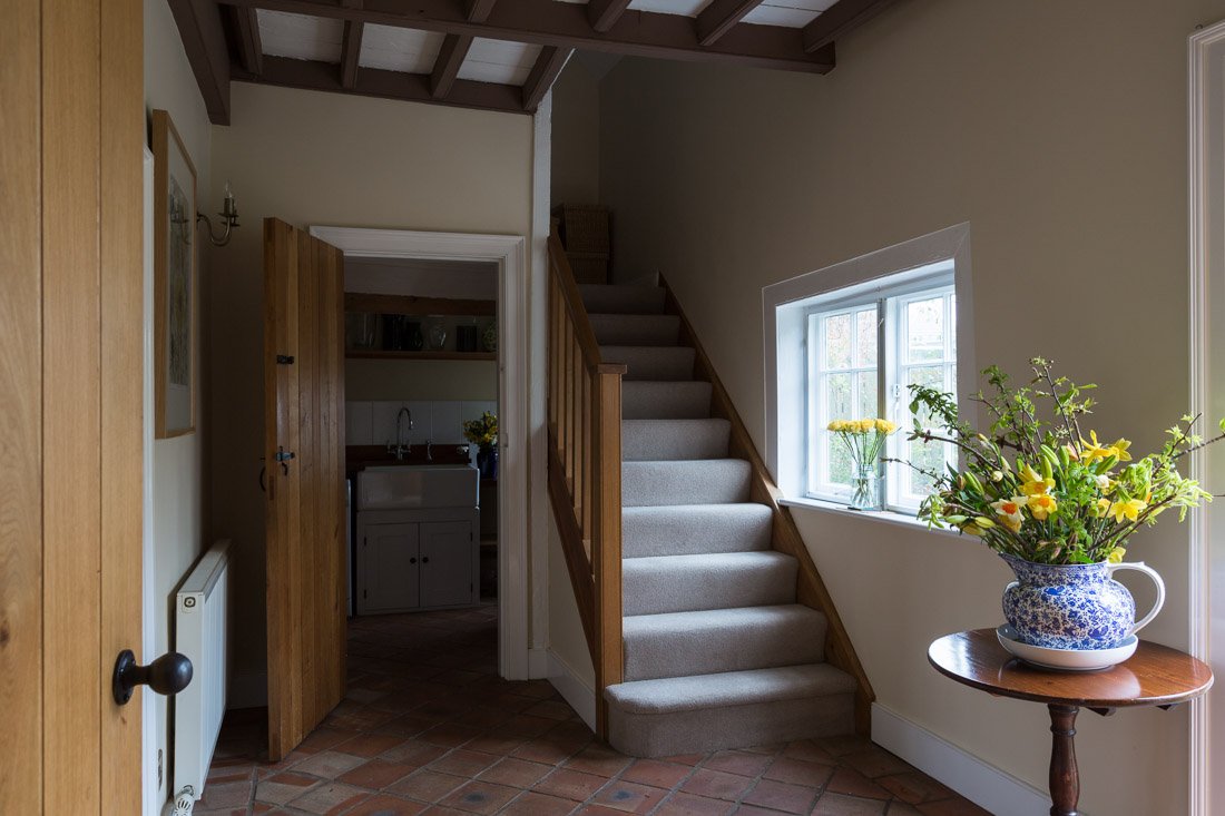
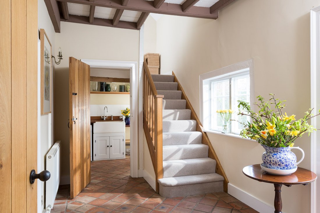
Finally, this farmhouse entrance hallway was absolutely packed with charm. Unfortunately the light balance between the rooms was too great to capture successfully in a single, unlit image. By adding a flash outside the window, in the utility and overhead I was able to create an image that rendered the spaces in a much more flattering ‘light’. The final additional flash to brighten the area at the top of the stairs invites the viewer to travel up into the house.

